
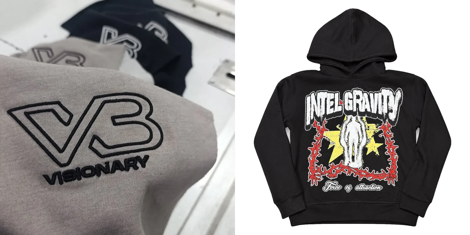
The short answer
Small logo — chest, sleeve, back of the neck — embroidery is usually the right call. It reads as premium and it survives washing.
Large logo, or a full graphic with lots of colour — print is usually the right call. A big embroidered back piece gets heavy, stiff and costly, while a printed graphic stays soft and can carry detail thread cannot.
Flat embroidery
Flat embroidery is thread stitched directly into the fabric. A digitised file tells the machine where each stitch goes, and the design builds up in thread — a texture you can feel, slightly raised off the surface.
It is the hardest-wearing decoration we offer: thread does not crack, peel or fade the way ink can. A chest logo embroidered on a custom hoodie will still look the same after a year of regular washing.
The limits are all about scale. Stitches have a minimum width: fine lines below about 1.5 mm disappear, and small text under roughly 6 mm tall turns into a blur. Redraw it with thicker lines, or print it instead.
Colour is the other limit. Every colour is a separate thread, changed one at a time, so most chest logos use two to four colours. Gradients are out: a gradient in thread becomes a series of stepped bands, never the smooth blend on your screen.
On a 400 GSM fleece it sits cleanly; on a very light jersey it can pucker unless the right stabiliser is used.
Stitch count affects the cost. A dense, filled-in logo costs more to embroider than a light outline of the same size.
3D puff embroidery
3D puff uses foam under the embroidery. The machine stitches over it, then the operator tears away the excess foam. The remaining foam gives the design its raised, rounded shape.
It is a statement method: a puff logo on a cap or a hoodie chest has a physical presence flat embroidery and print cannot match. The logo becomes a design feature, not just a mark.
Puff has stricter limits. The foam needs room, so designs have to be bold and simple. Thin lines collapse, and small text is out entirely — letters need to be large and chunky for the foam to hold its shape.
Puff also adds stiffness: a small chest puff feels fine, but a large panel across the back feels like a board and creases where the fabric folds. Never approve a puff design from a digital mockup — see the stitched sample first.
Screen printing
Screen printing pushes ink through a mesh screen onto the fabric, one colour at a time, each colour needing its own screen. The ink sits on the surface and cures into a flexible film.
This is the workhorse for graphics: large designs, bold shapes and solid colours, and the most economical way to print a run with the same artwork. A full back print on a tee, a big chest graphic on a hoodie — screen print is the default for all of it.
The feel depends on ink and coverage. A light, single-colour print feels soft and barely there; a large, solid print feels like a thin layer, and it will crack eventually if the garment is washed hard and often. That is normal for screen print, not a defect.
Each colour is a separate screen, so many-colour designs get more complex to set up. Photographic detail and gradients need halftone dots — tiny dots that read as a blend — and the result is never as smooth as the original. Small text under about 8 points gets hard to read, and thin lines can break up on textured fabric.
On smooth cotton jersey it prints clean; on fleece, fibres poke through the ink and soften the edges. On very dark garments, light colours need a heavier ink deposit to stay bright, which means a heavier hand feel. Check this on the sample, not on the full run.
DTF printing
DTF — direct to film — prints the design onto a film, coats it with adhesive powder, and heat-presses it onto the garment as a single thin layer.
DTF is the most flexible method for complex artwork: full colour, gradients, photographic detail and small text, with no screen per colour and no halftone compromise.
The trade-off is feel: a DTF transfer is a layer sitting on the fabric, and you can feel its edges. On a small chest print it is light; on a large back print it becomes a noticeable sheet — less breathable, stiffer than a screen print.
Durability is good when the press is done right and the garment is washed cold and inside out. A badly pressed transfer peels at the edges — a process failure, not a flaw in the method. The sample is the check: try to lift a corner with a fingernail. If it comes up easily, the press was wrong.
Puff print
Puff print is screen printing with an additive that expands when heat-cured, so the print rises into a soft, raised, slightly spongy texture. It looks like a print and feels like a relief.
It is a good middle ground: the dimension people like about 3D embroidery, with the colour freedom of print — a premium feel without the weight of a large embroidered panel.
Like screen print, it needs a separate screen per colour and cannot do photographic detail. The raised effect works best on bold shapes and solid areas — thin lines and small text do not puff evenly, and uneven puffing looks like a mistake.
Wash cold and inside out, and put that on the care label.
How each method holds up
Embroidery, flat or puff, is the toughest of the five. Thread does not wash out; the fabric around it wears first. Snagging is the real enemy, so finished embroidery should be checked for loose ends before packing.
Screen print and puff print wear gradually: ink cracks with repeated hot washing and tumble drying, starting at the edges and the creases. Washing cold and inside out slows this down a lot.
DTF sits between the two: a well-bonded transfer holds up well, but the edges are the weak point, and once an edge lifts it keeps going.
Mineral wash changes the picture: embroidery handles it well, print can fade or soften. If your design includes a wash, say so before sampling.
What to specify when you order
A decoration order fails most often on missing information. Send this with your brief and the sample round goes faster.
- Artwork as a vector file. AI, EPS or SVG, not a low-resolution PNG or a screenshot. Vector artwork scales cleanly and gives the digitiser something accurate to work from.
- Exact placement and size. "Chest logo" is not a placement. Give the measurements: how wide, how tall, and where it sits from the collar and the centre front. A chest logo is typically 9 to 11 cm wide; a back print is typically 28 to 32 cm wide.
- Colour references. Give Pantone references, not just "red" or "navy". Screens and thread are matched to a reference, and two people can mean different things by the same colour name.
- Fabric and garment. Name the fabric weight and blend. Embroidery and print behave differently on a 400 GSM fleece than on a 220 GSM jersey, and the factory will choose backing, stabiliser, ink and press settings around the fabric.
- Wash and finish. If the garment is going to be mineral washed or garment dyed after decoration, say so upfront. The order of operations — decoration before wash, or wash before decoration — has to be decided before sampling.
A simple way to decide
Look at the size of the design first. Small and bold: embroidery, flat or puff. Large or detailed: print, screen or DTF. Then look at the artwork. Few colours, clean shapes: any method works, and embroidery will feel the most premium. Many colours, gradients, fine detail: DTF.
If you are still torn, order the sample with both. A chest logo embroidered on one sample and printed on another settles the question in your hands instead of in your head. Our minimum is 30 pieces per style, samples take about a week and bulk takes about two weeks once the sample is approved.
The same logo may need two versions: a chest embroidery that works on a custom hoodie may need thickening for a custom t-shirt, because the lighter fabric moves more under the needle.
Talk to us about your decoration
Send your logo, your garment and your placement, and we will tell you honestly which method suits it — including when the artwork needs redrawing first. Request a quote or message us on WhatsApp at +92 300 4715677.